


Our logo:
We looked at how people interpret art and how art can have completely different effects on people. We looked into interpretation and uncoding subjects. This led into us researching codes and resulted in us creating our own code. We wanted something that was recognisable and stand alone. We also kept the element of interpretation that we had researched into by creating our own take on a code. Our code is easily legible and plays with the rough forms of the letters.

Poster and catalogue design:
This was one of our initial ideas. We included photos from the exhibition space and incorporated them into our design. We wanted contemporary colours that were light and reinforced the openess of the space itself.

This is the other design we did. This one is a different take on the previous idea, using one main bold colour to capture the audiences attention. We thought this design represented the exhibition better as it reinforced the fun element of interpreting and exploring art individually.

Our final Poster:
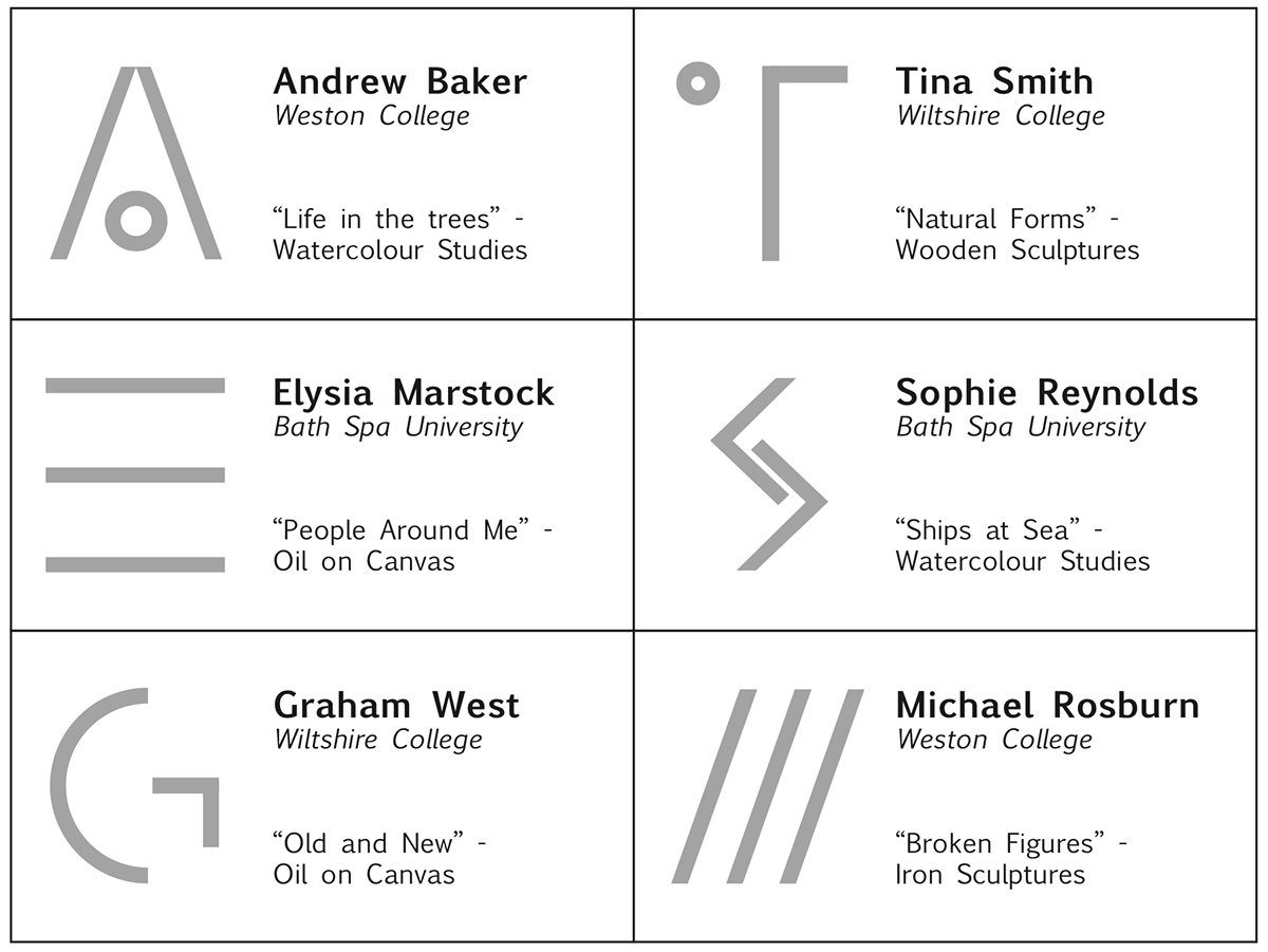
Name tags:
We decided to keep the name tags simple. We incorporated our code into the name tags to make it individual to each student.


